可直接使用的提示词
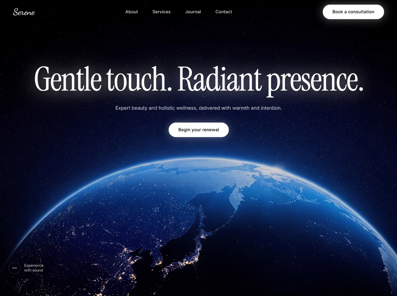
**Build a React + Vite + Tailwind CSS landing page with two full-screen sections for a luxury beauty/wellness brand called "Serene". Use TypeScript.**

---

### Fonts (loaded via Google Fonts in index.html)

Load these three font families from Google Fonts:
- **Dancing Script** (weights: 400, 500, 600, 700) -- used for the brand logo
- **Instrument Serif** (italic: 0, 1) -- used for the hero heading and the quote text
- **Inter** (weights: 300, 400, 500, 600, 700, 800, 900) -- used for body text, navbar links, and buttons

```html
<link rel="preconnect" href="https://fonts.googleapis.com" />
<link rel="preconnect" href="https://fonts.gstatic.com" crossorigin />
<link href="https://fonts.googleapis.com/css2?family=Dancing+Script:wght@400;500;600;700&family=Instrument+Serif:ital@0;1&family=Inter:wght@300;400;500;600;700;800;900&display=swap" rel="stylesheet" />
```

---

### Global CSS (index.css)

```css
@tailwind base;
@tailwind components;
@tailwind utilities;

* {
  margin: 0;
  padding: 0;
  box-sizing: border-box;
}

body {
  font-family: 'Inter', sans-serif;
  background: #0a0a0c;
  overflow-x: hidden;
}

.font-inter {
  font-family: 'Inter', sans-serif;
}

.font-instrument {
  font-family: 'Instrument Serif', serif;
}

.scrollbar-hide::-webkit-scrollbar {
  display: none;
}
.scrollbar-hide {
  -ms-overflow-style: none;
  scrollbar-width: none;
}

.liquid-glass {
  background: rgba(255, 255, 255, 0.01);
  background-blend-mode: luminosity;
  backdrop-filter: blur(4px);
  -webkit-backdrop-filter: blur(4px);
  border: none;
  box-shadow: inset 0 1px 1px rgba(255, 255, 255, 0.1);
  position: relative;
  overflow: hidden;
}

.liquid-glass::before {
  content: '';
  position: absolute;
  inset: 0;
  border-radius: inherit;
  padding: 1.4px;
  background: linear-gradient(180deg,
    rgba(255,255,255,0.45) 0%, rgba(255,255,255,0.15) 20%,
    rgba(255,255,255,0) 40%, rgba(255,255,255,0) 60%,
    rgba(255,255,255,0.15) 80%, rgba(255,255,255,0.45) 100%);
  -webkit-mask: linear-gradient(#fff 0 0) content-box, linear-gradient(#fff 0 0);
  -webkit-mask-composite: xor;
  mask-composite: exclude;
  pointer-events: none;
}

.text-glow {
  text-shadow: 0 0 40px rgba(255, 255, 255, 0.4), 0 0 80px rgba(255, 255, 255, 0.2), 0 0 120px rgba(255, 255, 255, 0.1);
}

.button-glow {
  box-shadow: 0 0 20px rgba(255, 255, 255, 0.3), 0 0 40px rgba(255, 255, 255, 0.1);
}
```

---

### App Layout (App.tsx)

The wrapper div has `bg-[#0a0608]`. It renders `<Hero />` followed by `<QuoteSection />`.

---

### SECTION 1: Hero

A full-viewport (`h-screen`) section with:

1. **Background video** -- autoplays, muted, loops, playsInline, covers the full section with `object-cover`:
   ```
   https://d8j0ntlcm91z4.cloudfront.net/user_38xzZboKViGWJOttwIXH07lWA1P/hf_20260613_180732_a54afbf6-b30d-470e-861f-669871f09f67.mp4
   ```

2. **Dark overlay** -- `absolute inset-0 bg-black/20`

3. **Fixed Navbar** -- `fixed top-0 left-0 right-0 z-50`, flex row, space-between, `px-6 md:px-12 py-5`:
   - **Left**: Brand name "Serene" in Dancing Script cursive, white, `text-2xl md:text-3xl`
   - **Center (desktop only, hidden on mobile)**: Navigation links -- "About", "Services", "Journal", "Contact" -- `text-white/80 hover:text-white text-sm tracking-wide`, spaced `gap-12`
   - **Right (desktop)**: White pill button "Book a consultation"
   - **Right (mobile)**: Hamburger icon (3 lines, animated to X on open). Uses cubic-bezier(0.22,1,0.36,1) easing. On open: top line rotates 45deg + translates down 9px; middle line fades/scales to 0; bottom line rotates -45deg + translates up 9px.
   - **Mobile menu**: Slide-in panel from right, `w-[85%] max-w-[340px]`, `bg-[#0a0608]/95 backdrop-blur-xl border-l border-white/10`. Links stagger-animate in (opacity + translateX, 75ms delay between each, starting at 150ms). Button at bottom with 450ms delay.

4. **Center content** -- absolutely positioned, flex column, centered, with `-mt-[120px]` to shift up:
   - **Heading**: `font-instrument text-white text-[36px] md:text-7xl lg:text-[110px] leading-[0.9] tracking-tight text-center text-glow` -- text: "Gentle touch. Radiant presence."
   - **Subtext**: `text-white/70 text-sm md:text-base text-center mt-5 md:mt-7 max-w-xl` -- text: "Expert beauty and holistic wellness, delivered with warmth and intention."
   - **CTA Button**: White pill button "Begin your renewal", `mt-6 md:mt-9`

5. **Sound indicator (desktop only)** -- bottom-left corner (`bottom-8 left-8`), a 40px circle with `border border-white/20` containing a small horizontal bar, next to two lines of text: "Experience" / "with sound" in `text-white/60 text-xs`

**Button component**: `bg-white text-black px-8 py-3.5 rounded-full font-medium text-sm tracking-wide hover:bg-white/90 transition-all duration-300 button-glow`

---

### SECTION 2: Quote Section (with parallax scroll animations)

A full-viewport (`h-screen`) section with:

**Background**: CSS linear-gradient top to bottom:
```
#010A17 0% -> #0A4267 30% -> #20658E 60% -> #6BADC4 100%
```

**Animated layers (requestAnimationFrame-based parallax with lerp smoothing):**

The animation uses a `progress` value (0 to 1) based on how far the section has scrolled through the viewport:
```
progress = clamp(0, 1, (windowHeight - rect.top) / (windowHeight + rect.height))
```

1. **Rainbow image** -- full-width, positioned `absolute inset-x-0 top-0 z-30`. Parallax: moves vertically from +120px to -160px based on scroll progress. Lerp factor: 0.06.
   ```
   https://soft-zoom-63098134.figma.site/_assets/v11/8d520a7515d06cbfc403d0125e3d05b1a7ccd29c.png
   ```

2. **Left cloud** -- `absolute left-0 bottom-[10%] z-10`, hidden on mobile (`hidden sm:block`). Width: `w-[500px] md:w-[650px]`. Has `marginLeft: '-50%'` to let it overflow left. Slides in from -200px on X when in view (progress 0.12-0.92), slides back out when not. Also drifts up (cloudY = progress * -50). Opacity tied to X distance. Lerp factor: 0.04.
   ```
   https://soft-zoom-63098134.figma.site/_assets/v11/0d6dfd3f90b930f21726f2ed56a3320d79b7a797.png
   ```

3. **Right cloud** -- same image as left but `scale-x-[-1]` (flipped), `absolute right-0 bottom-[15%] z-10`. Has `marginRight: '-75%'`. Slides in from +200px. Same lerp/timing as left cloud.

4. **Quote content** -- centered, `z-20`, `max-w-4xl`:
   - **Quote text**: `font-instrument text-white text-xl sm:text-2xl md:text-4xl lg:text-[42px] leading-[1.45] md:leading-[1.5]` -- text: "Serene was founded on a belief in beauty that honors your nature. We pursue refined outcomes, considered approaches, and lasting vitality. We spend time learning what matters to you before deciding what serves you best. No rushing, no excess -- just support that lets you feel radiant." (wrapped in curly quotes)
   - **Attribution**: `mt-6 md:mt-8 text-white/80 text-sm md:text-base tracking-wide` -- text: "Dr. Mia Callahan -- Founder"

**Key animation implementation detail**: All transforms use `translate3d` for GPU acceleration with `will-change-transform`. Initial cloud state is `opacity: 0` and translated off-screen. The lerp function smoothly interpolates current values toward targets each frame: `current + (target - current) * factor`.

---

### Tailwind Config

Default Tailwind config with no extensions -- all custom styling handled via CSS utility classes in index.css.
案例说明
面向身心健康的网页首屏效果,以3D 空间、玻璃拟态、视差滚动组织视觉层次;适合用于网页原型、品牌展示与交互动效参考。
适用信息
技术栈:React + Tailwind CSS + Motion
难度:进阶
标签:网页特效、网页首屏、3D 空间、玻璃拟态、视差滚动、悬停反馈、Wellness
动态效果预览
来源:AI妙词(已获授权转载),原条目 ID 218。