可直接使用的提示词
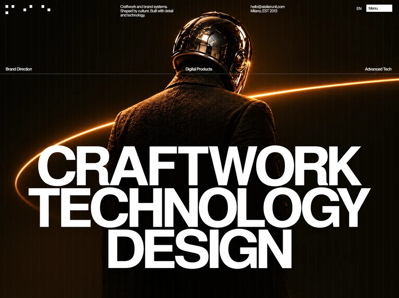
Build one standalone HTML file, a single full-viewport hero for Atelier Unit. No external CSS, no frameworks, no extra sections, no headings outside the page itself. Output only the complete document. Use these values exactly. Do not round, rename classes, restack the layout, or substitute a different video.

Document
- lang="en"
- charset utf-8
- viewport: width=device-width, initial-scale=1, viewport-fit=cover
- theme-color #0d0905
- title: Atelier Unit — Craftwork, Technology, Design
- html and body: margin 0, padding 0, height 100%, background #130e09

Fonts
- Family name "AU Grotesk"
- Regular: @font-face src url(assets/au-grotesk-regular.woff2) format("woff2"), weight 400, font-display:block
- Bold: @font-face src url(assets/au-grotesk-bold.woff2) format("woff2"), weight 700, font-display:block
- These are a Latin subset of TeX Gyre Heros (Helvetica / Neue Haas grotesque). Do not swap in Inter, Roboto, or a Google font.
- Body stack: "AU Grotesk", "Helvetica Neue", Helvetica, Arial, sans-serif
- color #ffffff
- -webkit-font-smoothing: antialiased; -moz-osx-font-smoothing: grayscale; text-rendering: geometricPrecision; font-kerning: normal
- links and buttons inherit color and font; links have no underline; buttons have no background, border, or padding, cursor pointer
- :focus-visible is a 1px solid white outline, offset 3px

Scale
Design frame is 1280 × 800. One design pixel equals --u, the largest uniform scale that fits the whole frame in the viewport.
- --vh: 1vh, and 1dvh where supported
- --ink: #ffffff
- --base-bot: #130e09
- --rule: rgba(255,255,255,0.115)
- --grid: rgba(255,255,255,0.0265)
- --menu-bg: #fcfcfc
- --menu-ink: #141414
- --small-min: 10px; at min-height 480px, --small-min becomes 11.28px
- --u: min(100vw / 1280, var(--vh) * 100 / 800)
- --small: max(var(--small-min), 12.6 * var(--u))
Heights map 1:1 to the screen. Extra width is absorbed by edge-anchored elements and the extended backdrop. Box-sizing border-box on everything.

Stage
.hero is position relative, isolation isolate, overflow hidden, width 100%, height 100vh and 100dvh, min-height 320px.
Its background is this exact vertical gradient:
linear-gradient(180deg, #0d0905 0%, #0f0a05 15%, #0d0a05 30%, #0d0905 45%, #0e0a06 60%, #0f0c07 75%, #130e08 90%, #130e09 100%)

Background video
Use this CloudFront URL and no other asset, local or remote:
https://d8j0ntlcm91z4.cloudfront.net/user_38xzZboKViGWJOttwIXH07lWA1P/hf_20261005_143740_52dbf3ef-ea20-4594-a1ad-91d6c2970159.mp4
It is a muted, looping, autoplaying, playsinline video of a figure seen from behind in a dark coat and a polished black mirrored helmet, with a thin amber arc behind the shoulders and low haze. Do not replace it with an image.

.hero__photo is role="presentation", position absolute, z-index -3.
- --pw: max(min(100vw, 1536 * var(--u)), var(--vh) * 160)
- --fade: clamp(0px, 100vw - var(--pw), var(--pw) * .08)
- top: var(--photo-top, 0px)
- left: (100vw - var(--pw)) * .5293, so the helmet stays at 52.93% across
- width var(--pw), aspect-ratio 16/10
- horizontal mask: transparent, black at --fade, black until 100% - --fade, transparent
The video fills the plate: display block, width and height 100%, object-fit cover, object-position center center.

Grid
48 hairline columns over the whole hero, z-index -1, pointer-events none.
Each column is an empty <i>. A 2px line sits at left: calc(75% - .5px), full height, color var(--grid). The first line is at three quarters of a column (20px at 1280).
Mask the grid with radial-gradient(ellipse 62% 95% at 50% 62%, rgba(0,0,0,0.83) 0%, #000 100%) so the lines recede behind the subject and headline.

Top bar
Logo: an <a href="#" class="logo" aria-label="Atelier Unit — home"> containing an inline SVG, viewBox 0 0 142.60 30.00, shape-rendering geometricPrecision, fill var(--logo-ink, #ffffff). Seven white squares, each 8.2 × 8.2:
- 0.00, 0.00
- 19.20, 0.00
- 76.80, 0.00
- 115.20, 0.00
- 57.60, 10.90
- 134.40, 10.90
- 0.00, 21.80
Logo position: left 20.65 * --u, top 12.8 * --u, width max(142.60 * --u, 96px).

Small type: font-size var(--small), line-height 1, weight 400, margin 0. Default letter-spacing --ls is -0.051em. Apply -webkit-text-stroke 0.022em currentColor on .small and .actions.

Tagline, class "tagline small", three stacked spans, left at 100% * 386.5 / 1280, top 12.6 * --u:
1. "Craftwork and brand systems." --ls -0.045em
2. "Shaped by culture. Built with detail" --ls -0.051em
3. "and technology." --ls -0.045em

Contact is an <address class="contact small">, font-style normal, left at 100% * 798.5 / 1280, top 12.5 * --u:
- mailto:hello@atelierunit.com, text hello@atelierunit.com, --ls -0.047em
- "Milano, EST 2013", --ls -0.069em

Actions, right 32 * --u, top 13 * --u, flex, align center, gap 1.22em, font-size var(--small):
- button.lang, type button, aria-label "Language: English", text EN, --ls -0.064em, line-height 1, translate(0em, 0.139em), text-stroke width 0.01em
- button.menu, type button, aria-expanded false, text "Menu" inside a span, --ls -0.055em. The button is 6.349em wide, 1.508em tall, background #fcfcfc, color #141414, text-align left, padding-left 0.33em, line-height 1.508em. The span is translated 0 on Y. On hover-capable devices the background becomes #fff.

Services and rule
A ul.services.small, aria-label Services, no list style, absolute, full width, top 211.75 * --u. Font size max(var(--small-min) * 1.06, 13.3 * --u), line-height 1. Each li is absolute, nowrap, text-stroke width 0.008em, and the words sit in a span.rv:
1. "Brand Direction", left 20 * --u, --ls -0.047em
2. "Digital Products", left 50% - 3 * --u, translateX(-50%), --ls -0.0485em
3. "Advanced Tech", right 33.25 * --u, --ls -0.064em
A .rule div, aria-hidden, full width, top 239 * --u, height 1px, background var(--rule), z-index -1, box-shadow 0 -1px 0 rgba(255,255,255,.038), 0 1px 0 rgba(255,255,255,.014).

Headline
An h1.hl, aria-label "Craftwork, technology, design". Position absolute, left 50%, bottom 0.49140em, margin 0, width 0, height 0, font-size 170.94 * --u, weight 700, line-height 1, letter-spacing 0, nowrap.
Each line is a span.hl__line containing span.hl__clip containing span.hl__track containing one span per letter. Lines are aria-hidden because the h1 already has the accessible name.
Letter placement is in em. Each letter is position absolute, left var(--x), top -0.909em, transform-origin 0 0, and this exact transform:
translateY(calc(0.909em + var(--dy, 0em))) scale(var(--sx), var(--sy)) translateY(-0.909em) translateY(0.5445em) scaleY(var(--k, 1)) translateY(-0.5445em)

Line 1, CRAFTWORK, --b 1.56780em, --dy -0.00275em, --sy 1.0063
C -3.04844em sx 1.0769 k 1.0055
R -2.35055em sx 1.0093
A -1.68881em sx 1.0542
F -1.00202em sx 0.9712
T -0.41697em sx 0.9516
W 0.15715em sx 0.9612
O 1.01367em sx 0.9833 k 1.0055
R 1.69181em sx 1.0093
K 2.33501em sx 0.9371

Line 2, TECHNOLOGY, --b 0.78390em, --dy 0.00059em, --sy 0.9950
T -3.16648em sx 0.9516
E -2.64032em sx 0.9875
C -2.06523em sx 1.0678 k 1.0055
H -1.36691em sx 1.0031
N -0.71845em sx 1.0161
O -0.05103em sx 0.9833 k 1.0055
L 0.62228em sx 0.9965
O 1.14822em sx 0.9833 k 1.0055
G 1.85243em sx 1.0231 k 1.0055
Y 2.50618em sx 0.9953

Line 3, DESIGN, --b 0.00000em, --dy -0.00281em, --sy 0.9918
D -1.77928em sx 1.0751
E -1.09091em sx 0.9983
S -0.48284em sx 1.0123 k 1.0055
I 0.11501em sx 1.0530
G 0.32558em sx 1.0231 k 1.0055
N 1.03138em sx 1.0062

Responsive
Break on composition, not a generic device width.

When max-aspect-ratio is 114/100 (portrait-leaning tablets and phones):
- --small-min 12px
- --m clamp(16px, 3.2vw, 32px)
- --bar-top calc(var(--m) * .64)
- logo, tagline, contact, and actions use that top; logo left and actions right use --m
- photo width becomes var(--vh) * 138.6, top var(--vh) * 15, and the mask switches to a top fade: transparent 0, black at 11%
- services top is var(--vh) * 44; first label left --m, second left 50%, third right --m
- rule top is var(--vh) * 44 + 2.1em, font-size var(--small)
- headline font-size is (100vw - 2 * var(--m)) / 6.3063, bottom max(0.49140em, 18px + safe-area-inset-bottom)

When that aspect also has max-width 679px, move to two rows:
- --small-min 11.5px
- --bar-top includes safe-area-inset-top
- logo width 104px
- actions gap 14px
- tagline left --m, top 70px plus safe-area top, spans stay block
- contact right --m, same top, text-align right

When that aspect also has max-width 309px:
- contact drops to 70px + 3em + 12px plus safe-area top
- service labels may wrap, width min-content; center is centered, right is right-aligned
- photo top --ptop is the max of 15vh and the min of (150px + safe-area top) and (71vh minus the headline bottom offset minus 2.30em of headline size minus 56px), using --F = (100vw - 2 * --m) / 6.3063
- services top is --ptop + 29vh
- rule top is --ptop + 29vh + 3.1em

Landscape phones, max-height 479px and min-aspect-ratio 1141/1000, keep the desktop composition:
- --small-min 11.5px
- --mL max(16px, safe-area left), --mR max(16px, safe-area right)
- --bar-top 16px * .64
- logo left --mL
- tagline left is --mL + 96px + 2em
- contact is right-anchored at --mR + 8.83em + 2em
- actions right --mR
- services use the safe-area margins, with the center label centered in the remaining width
- headline is centered in that same safe width, bottom max(0.49140em, 8px + safe-area bottom)

If that landscape case is also under 560px wide, contact moves under the controls: right --mR, top --bar-top + 2.6em, text-align right.

On coarse pointers, enlarge hit areas without changing the drawn shapes. .lang, .menu, .logo, and the contact link get a centered ::after at least 44px tall. Lang extends 12px left and half the action gap right. Menu extends half the gap left and 10px right. Logo extends 10px each side. The mail link extends 6px each side, height max(100%, 32px).

Entrance, once on load
Before first paint, if motion is allowed, add class is-entering to the html element and set a 4500ms failsafe that removes is-entering and is-playing. If prefers-reduced-motion is reduce, skip the class. If JS never runs, the page is simply static.

The video and grid never animate. Only the foreground does, and only while html.is-entering is present. Animations start paused via --au-state:paused, then run when is-playing is added.
Easings:
- --e-expo: cubic-bezier(.16, 1, .3, 1)
- --e-quint: cubic-bezier(.22, 1, .36, 1)
- --e-sweep: cubic-bezier(.76, 0, .24, 1)

Keyframes:
- au-rise: translate from 0 var(--rise) to 0 0
- au-soft: that same rise plus opacity 0 to 1
- au-draw: scaleX 0 to 1
- au-wipe: clip-path inset(0 100% 0 0) to inset(0 0 0 0)
- au-on: opacity 0 to 1

Timing:
- rule draws from the left, origin 0 50%, au-draw .85s --e-sweep, delay .24s
- each headline track rises 1em, au-rise 1.05s --e-expo; delays .10s, .18s, .26s. Clip is inset(-.8em -3.6em -.05em -3.6em)
- service labels rise by calc(100% + .6em), au-rise .8s --e-quint; delays .56s, .62s, .68s. Each li is clipped with inset(-.25em -.4em -.35em -.4em), and .rv is inline-block
- logo squares switch on in .14s ease-out. Delays by square order: 0.700s, 0.735s, 0.840s, 0.910s, 0.805s, 0.945s, 0.700s
- tagline lines, contact lines, and EN rise .55em with opacity, au-soft .75s --e-quint. Tagline delays .78s, .83s, .88s. Contact delays .88s, .93s. EN duration .6s, delay .98s
- Menu wipes open last, au-wipe .6s cubic-bezier(.25, 1, .5, 1), delay 1.02s
- will-change translate, transform on the headline tracks, rule, and service labels
- when motion is allowed, Menu background-color transitions in .15s

Playback script
After fonts are ready, or after 1200ms if they are not, add is-playing on the next frame. Wait for every animation whose name starts with "au-" to finish, and also set a 2200ms timeout. Then remove is-entering and is-playing and clear the failsafe so nothing keeps running. If reduced motion is set, remove autoplay from the hero video and pause it.

Do not add a menu panel, language menu, loader, footer, or extra copy. Menu and EN are visual controls only.
案例说明
通过建筑影像、网格排版与项目索引呈现专业作品集,适合建筑事务所和空间设计团队。
适用信息
技术栈:React + Tailwind CSS + Motion
难度:进阶
标签:网页特效、鼠标跟随、悬停反馈、沉浸式视频、动态渐变、Portfolio
动态效果预览
来源:AI妙词(已获授权转载),原条目 ID 5868。